Accessibility
These are the key guidelines to follow while designing new interactive screens to ensure most visitors can access the content. Like the rest of the DLS, this section will be expanded as more testing of new screens takes place.
Wall-mounted screens
For wall-mounted screens, all actions should be positioned within the bottom half of the screen. Typically, screens are hung on a 1.5m centre line. New Zealand Access Standards (NZS 4121:2001) state that people in wheelchairs can typically reach 1350mm from side on (note, this typical reach height is lower when the screen is approached from front on).
Lower half of mounted screens
As a rule, keep all interactive hotspots in the bottom half of wall-mounted screens to ensure a person in a wheelchair with limited reach can still access them.

Place hotspots in the bottom half of wall-mounted screens.
Accessibility controls
If there is a compelling reason to have interactive hotspots in the top half of the screen, provide a secondary way to navigate the content, such as using an accessible detached set of controls. Users can select and activate options using the menu, similar to the keyboard accessibility technique of tabbing through links on a website.
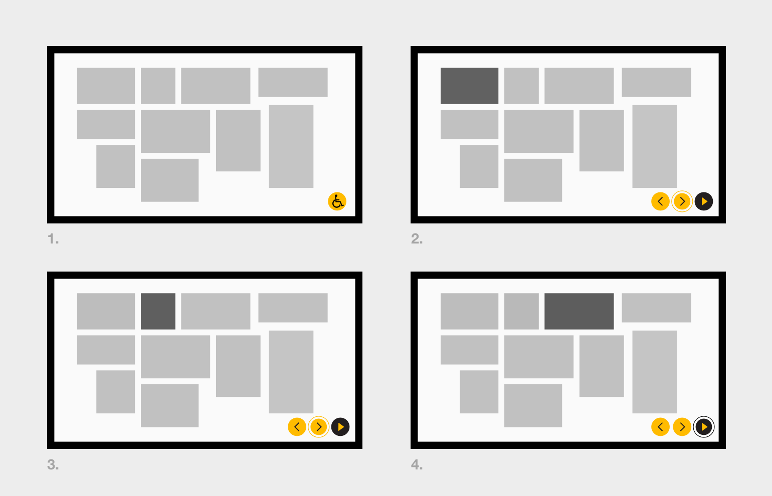
Accessible menu allows for navigation of all content. The signal for the menu is placed in an obvious, easy-to-reach location and signified using an easily recognisable symbol (1); content is navigated using arrow buttons (2 & 3); content is selected (4).
Kiosk screens
Viewing a screen from the position of a wheelchair can compromise its readability. Consider:
- Angle of the screen: Check that the screen remains readable when viewed from a low angle.
- Lighting: Be aware of how lights above the screen can reflect more when viewed from a lower angle.
Colour contrast
Use contrasting colours when styling text and interactive elements to ensure people with colour blindness or low vision can still access information. The New Zealand Government Web Accessibility Standard provides clear guidelines on correct use of contrast on screens.
Interactive elements should employ other design features to convey their interactivity, such as using icons, button shapes and/or underlined text.
Online tools can help determine the correct level of contrast required.
Subtitles
English subtitles should be provided on all video content to ensure people who are deaf or hearing-impaired are able to access the audio content. These should be displayed by default to ensure no content is missed by this group. It is preferable to also supply reo Māori subtitles where possible.
More on subtitles.
More research is required to determine what the organisation-wide support for other languages should be.