Video
Use these patterns and guidelines when creating a video object in your interactive. The patterns generally apply to an interactive with a single video, or to video used as part of a bigger interactive.
Poster

The graphic representation of a video before a user has selected to watch it is referred to as its ‘poster’. A poster should have the following components:
- Icon
- Standard play icon centered over the image
- Title
- Left-aligned
- Duration
- mm:ss format
- Less prominently styled than the title
- Image
- Best with subtle motion or a small loop of 2–3 stills
- Image(s) should reveal key aspects of the video. For example, if the video involves an interview with an artist, showing a moment of this interview will help the user understand what content is available.
- Gradient overlay
- Used to keep text readable regardless of the background
- Recommended color: black 60% opacity ➝ 0% opacity
- Hotspot
- Entire image is a hotspot to activate the video (not just the play button)
Note, it is a deliberate action to partially obscure the image with a large play icon. This reinforces the need for interaction from the user to prevent users from mistaking the screensaver for ambient content.
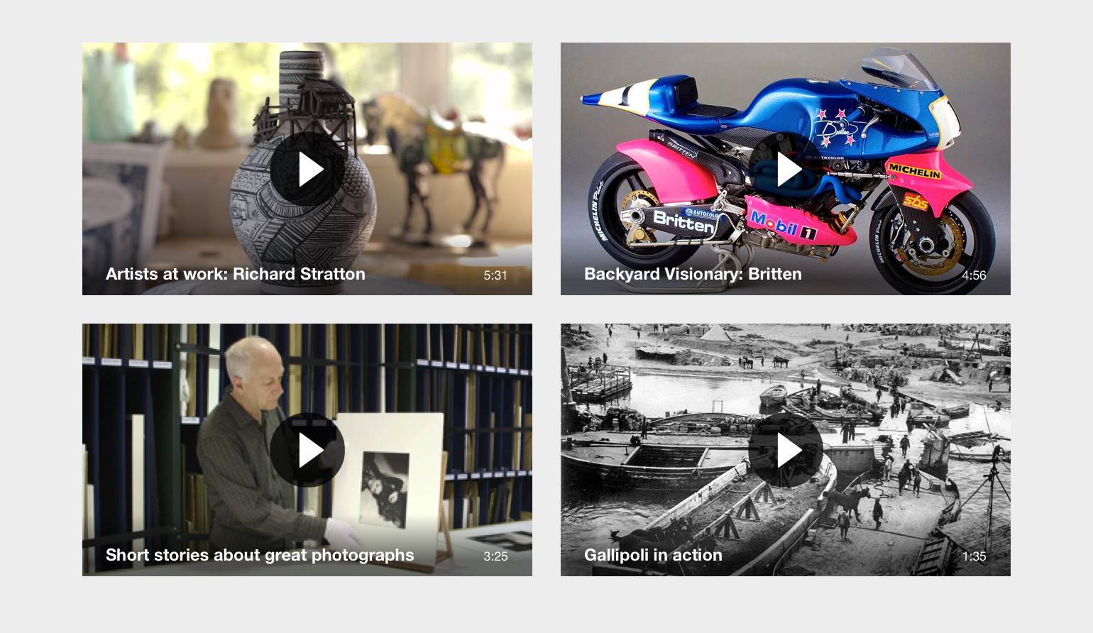
Figure: Examples of how this standardised poster works with various content.
Playback interface
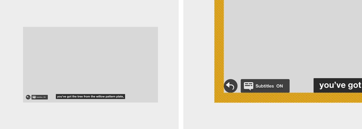
Figure: Basic video interface layout. Note the position of the buttons to the bottom left, the equal spacing between the side and bottom of the screen and the alignment with the subtitles.
The interface for video playback consists of a few key items:
- Back button
- Subtitle button
- When there is a single language available, use the
toggleversion - When there are multiple languages available, use the
flyout-menuversion
- When there is a single language available, use the
- Subtitles
The interface elements (Back and Subtitle buttons) should remain onscreen during playback so that they remain discoverable to visitors.
Subtitle toggle button
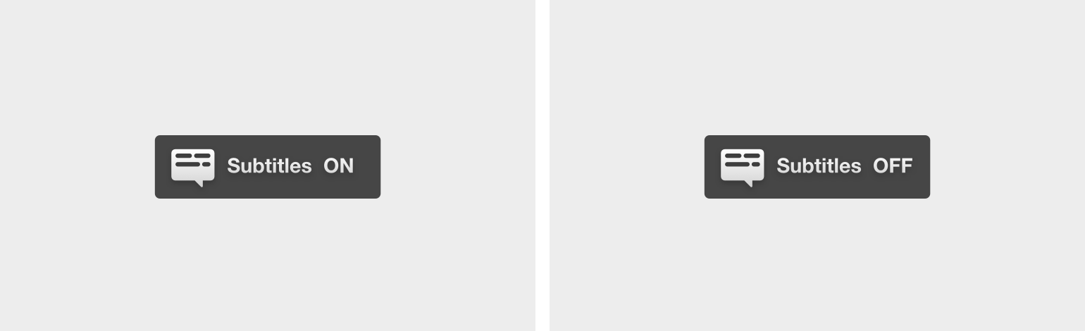
Figure: The toggle version of the subtitle button.
Subtitle flyout menu button
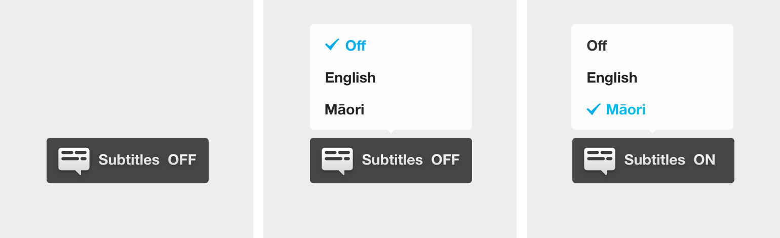
Figure: The flyout-menu version of the subtitle button for multiple languages.
Important: The button should read Subtitles ON when the subtitles are currently active. It reveals the current state of the subtitles, not the resulting action.
Subtitles
Design
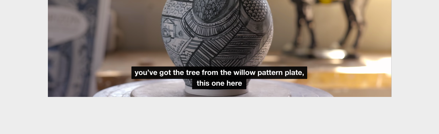
The design for subtitles should follow:
- Helvetica Neue Bold
- White
rgba(255, 255, 255, 1)on a semi-transparent black backgroundrgba(0, 0, 0, 0.5) - Centred horizontally and positioned at the bottom of the screen
- Background box clipped to the width of the text
Editorial
Follow BBC’s extensive guidelines for creating subtitles:
Online Subtitling Editorial Guidelines v1.1
A few notable features from the guidelines:
- The maximum line length should be roughly 34 characters long.
- The maximum number of lines displayed at one time should be 3, but ideally only 1 or 2.
- Place line breaks only when necessary and at logical points, for example, at the end of a clause or phrase.
- Be cautious with editing the transcription. It can be condescending to deaf or hearing impaired people and confusing to lip readers. It might be appropriate, however, to edit the text for a particularly busy sequence where quickly changing subtitles would be too difficult to follow.
Retrieved from BBC’s Future Media Standards and Guidelines site, licenced under the Open Government Licence v2.0.