Call to action
Use obvious and consistent calls to action to inform users on how to use the interface.
EDIT: Add button style examples
Avoid instructions
Avoid the tendency to explain your interface.
Don’t do this:
Touch the screen to play the video
Avoid instructions like this by creating a clear call-to-action. If an element on the screen is interactive, it should signal that it is interactive by way of colour, icon and style.
Tips on avoiding instructional text
- Next / Previous: Use the titles of the next and previous objects as labels, rather than obscure
NextandPrevious. - Touch here to…: Always avoid this. Don’t talk about the interface or how to use it, but instead use active words for labels that describe what will happen (eg
PlayorRead moreorShare on Facebook). - Toggle: If an action has only two possible choices (such as two languages), it can be simpler to put either both options, or just the alternative option, on screen to provide a way to toggle between choices. In other words, avoid obscure labels like
Language settings. This doesn’t tell the user which languages are available. Possible alternatives include:- Show two actions such as
English / Te Reo Māoriand highlight the currently active language. - If there is ample amount of text onscreen, show the alternative language choice only (eg, if English is currently active, provide an action
Te Reo MāoriorSwitch to Te Reo Māori).
- Show two actions such as
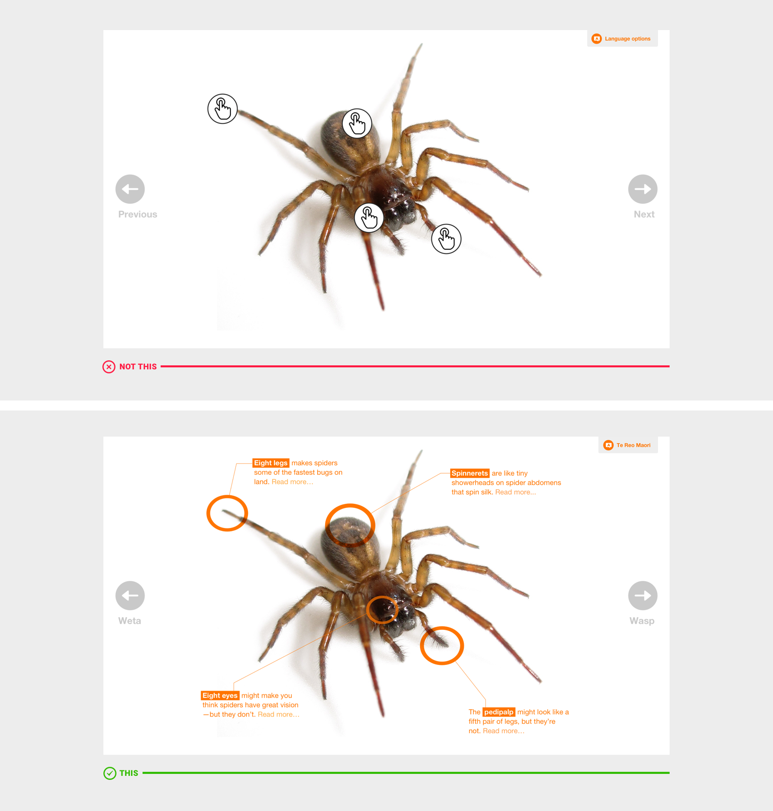
The top example screen clearly demonstrates how content can be hidden by obscure icons or labels. The bottom example contrasts by stating what other language is available, the titles of the next and previous items and by bringing a snippet of content to the fore. A user can more easily expect what each action will do and choose accordingly.