Natural mapping
When representing objects on display, create a close visual match between the interface and the display.
Where possible, represent the digital content in response to the layout of its related physical object. This doesn’t require an exact 1:1 relationship, but consider how it can reduce the cognitive load of the user to map them in similar layouts (see the example of the stove top controls).

Example of natural mapping: The stove top on the left is not using natural mapping; there is no obvious relationship between the controls and the burners. The stove top on the right utilises the natural mapping principle: the relationship between each control and burner is obvious and requires no written instruction or ‘trial-and-error’ approach from the user.
A skeuomorphic result is not the intention, but to make the interface intuitive and obvious so the user doesn’t have to “learn” the interface.
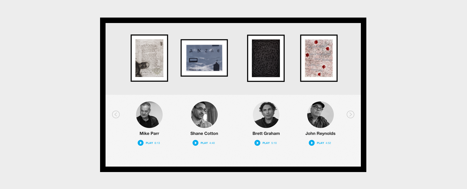
An example of natural mapping in an interactive can be taken from the Anzac Print Gallery screen. The screen housed 10 videos, each one directly linked to one of the 10 artworks displayed on the four walls. The 10 videos were displayed in the same order on four separate menu pages of the interactive to create a strong link between the physical artwork hung on the wall and the digital video content about each piece.

One of the four menu screens from the Anzac Print Gallery interactive, demonstrating the principle of natural mapping. Note, touching on the artwork, artist’s picture or name, or the Play button triggered the video. The screen looped between the four menu screens removing the need for a screensaver.