Digital labels
Patterns for digital labels.
Wireframe overview

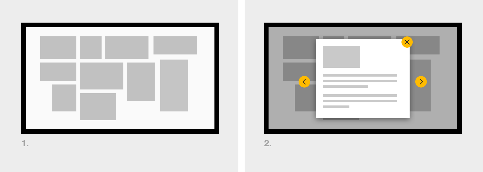
Wireframe showing basic interaction for a digital label: menu screen and detail screen.
Menu screen
The menu screen forms a key component of the digital label. Content items are presented to the user enabling them to make their selection.
- Photography: Using a photograph of the objects in place is one possible solution to a menu screen as it very clearly links the physical to digital. Be careful to ensure the objects appear interactive (use of buttons) and that the purpose of touching the objects is clear: Is it obvious what content lives beneath?
- Layout: Adopt natural mapping principles for the graphical layout, if possible.
- Choice overload: If there is a large number of items to select from, consider splitting them into separate menu pages that can be navigated using Previous and Next buttons. Aim to split the items into groups that relate in some way to their physical display (eg, a single menu page for a single display case).
Detail screen
The detail screen displays the label content. It might contain:
- Title of the object
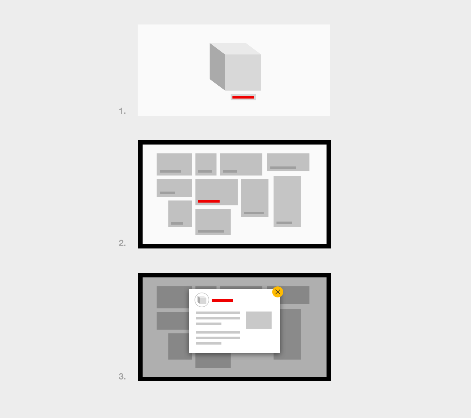
- Image of the object. Confirm that this story is attached to the physical object. This could be achieved by using an image of the actual object paired with the title before introducing any of the other supporting text of imagery (see #3 of the ‘uniform title’ image below).
Uniform title
Use the same title for an object in all of the places it is referred to. For example:
- The physical object label positioned by an object
- The title of the digital content on the menu selection screen
- The title of the article itself

The title of the object is consistent from physical object on the floor (1), to the digital interface’s menu (2) and detail screens (3).